Stone, grass and redstone buttons. Bevels flip when pressed, and every press clicks.
MINECRAFT-LIKE UI · REACT · VUE · SVELTE
Minecraft-inspired components for UI SDK.
A Minecraft-like UI library: 55 components with pixel frames, click sounds and a narrator. Install from a shadcn registry.
Install components from the Mine UI shadcn registry,
https://mineui.laravel.cloud/r/registry.json
Wrap the app in <Mine> from components/ui/mine.
Showcase
Small apps built only from these components. Each has its own page.
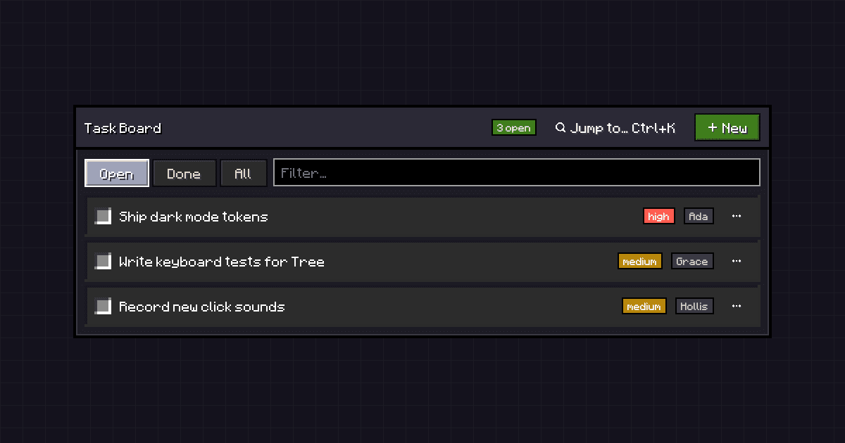 01Task Board
Filter, tick off, reprioritize and delete tasks. Add one through a validated dialog, or jump with Ctrl+K.
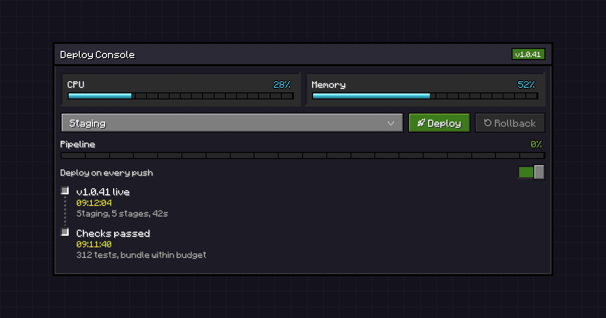 02Deploy Console
Live meters, a staged deploy pipeline, environment select, rollback and an activity timeline.
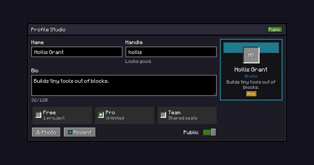 03Profile Studio
Edit a profile and watch the card update: validation, photo upload, accent color and plan.
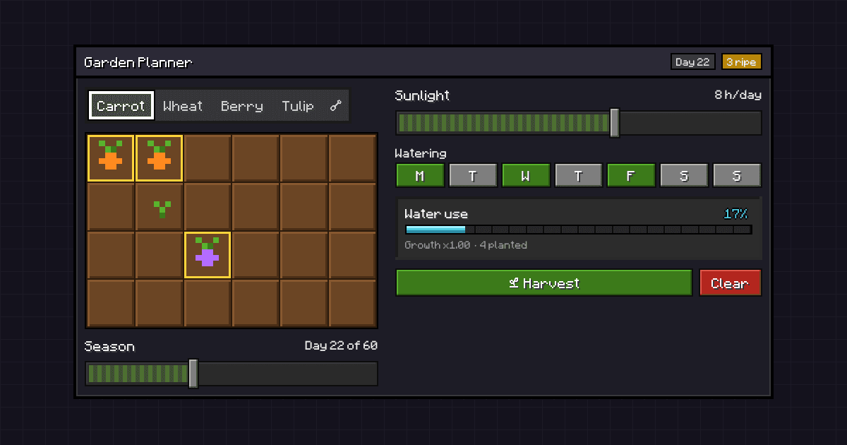 04Garden Planner
Plant with clicks or arrow keys, scrub the season, tune sun and watering, then harvest what is ripe.
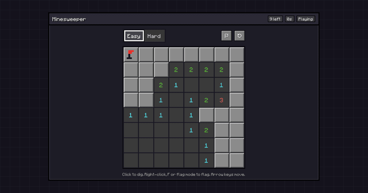 05Minesweeper
Dig a minefield. The first dig is always safe; flag with right-click, F or flag mode. Fully keyboard playable.
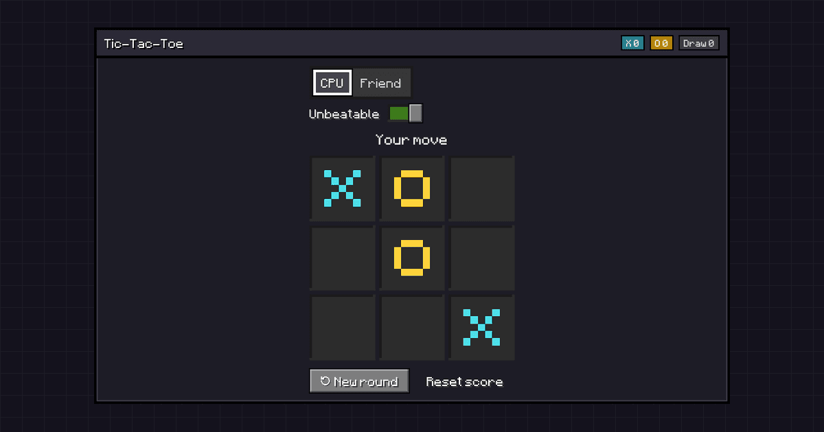 06Tic-Tac-Toe
Play the computer, casual or unbeatable, or pass the keyboard to a friend. Keeps score.
Install
Add the theme once, then any component.
- 1The theme
Skin, font, sounds and narrator.
- 2A component
Any one, plus its demo.
- 3Everything
All components and blocks.
Components
55 in total. Try them here, or open one for its code and install command.
Actions
Q3 Roadmap
Edited by Hollis Grant
A button that stays pressed in, like a lever.
A bar of tool buttons with roving focus.
A hotbar of choices with a white selector that slides between slots.
- Q3 roadmap.pdf2.4 MB
- Launch checklist.md12 KB
- Offsite photos24 items
- Brand assets.zip18 MB
Remembered view settings, like list or grid.
Forms
Choose a unique username for your account.
Ties a control to its label, hint and error.
Names a control. Pressing it focuses the control.
https://
Shown on your public profile.
A black text field with a gray frame that turns white on focus.
A multi-line field for signs and books.
Use at least 8 characters.
A secret field with a show and hide toggle.
A count with stone plus and minus keys.
One slot per character, like a code lock.
Text that turns mentions into purple tokens.
An inset slot that fills green when ticked.
Pick exactly one, each in its own slot.
A stone lever that clacks across a slot.
An options-screen slider with a narrow stone handle.
A score in pixel hearts.
A stone trigger that opens a dark item list.
Type to filter a list, then pick one or several.
Suggestions as you type, like chat commands.
A menu that opens on a typed character, like @ or /.
A date typed segment by segment.
A time typed segment by segment.
MM/DD/YYYY
Type a date or pick one from a calendar popup.
Drag and drop files here
Or paste them from your clipboard.
Drop or browse for files, listed below the zone.
An area, hue and alpha sliders and swatches.
Overlays
A light gray window over a dimmed world.
A window that asks before anything is destroyed.
A sheet that slides in from an edge.
A violet-framed popup anchored to its trigger.
A preview that opens on hover or focus.
Add to library
An item-name tooltip with a violet frame.
Actions and settings in a popup, with submenus.
A row of menus, like an app's File and Edit.
Suggestions
Calendar
Search Emoji
Calculator
Settings
Profile
Billing
Settings
A command palette with groups and shortcuts.
Advancement toasts that slide in with a fanfare.
Navigation
Choose your language, time zone and the page you start on.
Inventory-style tabs over a dark panel.
Site navigation with dropdown panels.
Stone page keys with the current page in grass.
app
layout.tsx
page.tsx
settings
components
components.json
package.json
README.md
Nested folders you can open and close.
Comments
Mentions
Reactions
New sign-ins
Billing
Hold Shift to select a range, or Ctrl or ⌘ to add one.
An always-open list to pick from.
Display
We offer standard (5 to 7 days), express (2 to 3 days) and overnight shipping.
Every order ships with tracking, and orders over $50 ship free.
Stacked stone headers that open their panels.
One header that shows and hides its content.
Pushpak

A player head in a slot, with a fallback.
October 2026
| Sun | Mon | Tue | Wed | Thu | Fri | Sat |
|---|---|---|---|---|---|---|
| 27 | 28 | 29 | 30 | 1 | 2 | 3 |
| 4 | 5 | 6 | 7 | 8 | 9 | 10 |
| 11 | 12 | 13 | 14 | 15 | 16 | 17 |
| 18 | 19 | 20 | 21 | 22 | 23 | 24 |
| 25 | 26 | 27 | 28 | 29 | 30 | 31 |
A month grid with the chosen day in grass.
Slides you page through with stone arrows.
Exporting video60%
An experience bar that fills in steps.
Storage used68%
A reading on a diamond-blue bar.
Hollis Grant
hollis@example.com
Designs the billing and onboarding flows, and reviews every new pricing page.
A chiseled line between sections.
Tags
- v1.2.0-beta.50
- v1.2.0-beta.49
- v1.2.0-beta.48
- v1.2.0-beta.47
- v1.2.0-beta.46
- v1.2.0-beta.45
- v1.2.0-beta.44
- v1.2.0-beta.43
- v1.2.0-beta.42
- v1.2.0-beta.41
- v1.2.0-beta.40
- v1.2.0-beta.39
- v1.2.0-beta.38
- v1.2.0-beta.37
- v1.2.0-beta.36
- v1.2.0-beta.35
- v1.2.0-beta.34
- v1.2.0-beta.33
- v1.2.0-beta.32
- v1.2.0-beta.31
- v1.2.0-beta.30
- v1.2.0-beta.29
- v1.2.0-beta.28
- v1.2.0-beta.27
- v1.2.0-beta.26
- v1.2.0-beta.25
- v1.2.0-beta.24
- v1.2.0-beta.23
- v1.2.0-beta.22
- v1.2.0-beta.21
- v1.2.0-beta.20
- v1.2.0-beta.19
- v1.2.0-beta.18
- v1.2.0-beta.17
- v1.2.0-beta.16
- v1.2.0-beta.15
- v1.2.0-beta.14
- v1.2.0-beta.13
- v1.2.0-beta.12
- v1.2.0-beta.11
- v1.2.0-beta.10
- v1.2.0-beta.9
- v1.2.0-beta.8
- v1.2.0-beta.7
- v1.2.0-beta.6
- v1.2.0-beta.5
- v1.2.0-beta.4
- v1.2.0-beta.3
- v1.2.0-beta.2
- v1.2.0-beta.1
A scrolling well with a stone thumb.
Files
- page.tsx
- layout.tsx
- globals.css
page.tsx
Saved just nowTerminal
Ready on port 3000Panels split by handles you can drag.
Deployed to production
Version 2.4.1 is live in every region.
Checks passed
312 tests and the bundle size budget.
Pull request merged
Ada merged Cache search results into main.
Review requested
Grace and Linus were asked to review.
Events in order, with progress markers.
Name
Size
DOMContentLoaded
/
14 kB
app.css
8 kB
app.js
212 kB
inter.woff2
48 kB
api/user
1 kB
avatar.png
36 kB
Spans on a time axis, like chunk loading.

Crop and flip an image with handles.